[Study] How Brand Identity Plays On Social Media And In Sales.
Jenn Smith Digital Direct Marketing, Health Care Marketing, Insurance Direct Marketing, Medicare Marketing, Response Marketing, Trends and POVGoing Beyond Brand “Likes” … Getting Consumers To “Buy!”
When Facebook hosted a webinar on how to leverage “visual identity” in ads to maximize direct response creative effectiveness, we were highly intrigued …
At DMW, we focus on maximizing and leveraging a client’s brand awareness as a vital element in our work as a direct response agency. How we do that is through our Action Branding™ discipline, which goes beyond traditional brand advertising awareness and engagement to motivate and stimulate target audiences to Act Now!
In the recent webinar, Facebook defined visual identity as “the consistent colors, fonts, logo, tone, and look/feel that represents a brand.” How important is a brand’s visual identity on the platform?
Well, a recent study among nine creative clients on Facebook showed that a strong visual identity drove 67% more conversions, a 67% higher lift in ad recall and 71% higher incremental return on ad spend (ROAS). So, what is visual identity?
Let’s break down the 4 key components of visual identity:
• Logo – consistently using a branded logo helps drive recognition
• Type – weaving in a signature typeface within ads creates visual identity in a bold, ownable way
• Color – having a consistent color palette helps differentiate your brand in your industry

Image Source: Facebook
• Mnemonic – having a distinct character, spokesperson, jingle, slogan, product, or other visual device creates a memorable experience for a user
Every ad is an opportunity to break through the clutter of Facebook ads. And consistent visual identity within both paid and organic posts helps to build brand recognition.
The key takeaways from Facebook’s webinar …
• Every visual ad is a distinct opportunity to differentiate from the competition and build recognition and trust among valuable customers
• Consistency between paid/organic creative helps customers identify your brand
• A visual identity can drive ROI
Added real-world insight from DMW: how to get visual identity and direct response, all in one!
As noted earlier, while the DMW team is “all-in” on brand, our work goes beyond branding and awareness — we help fill the sales funnel! Whether it’s for our core client categories — health care and health insurance — or any other industry, we develop strategic creative that stands out in the marketplace, and motivates consumers to act.
Some DMW brand identity/response successes to share …
The Facebook webinar had some great insight, but how do you apply those overall directional notions? How do you go about implementing?
And while the Facebook study of nine clients is a rather small sample size, DMW has seen the same results time and time again. A few examples implemented in market not only adhere to the principles above, but we can also vouch that they worked!
1. Advantage MD
When we launched a new Medicare Advantage plan in the highly competitive state of Maryland, we couldn’t rely on the plan sponsor’s world-renowned brand name, Johns Hopkins, to drive leads. We had to create an all-new Medicare insurance brand, one that instilled trust instantly, i.e., within the Johns Hopkins family, and promoted a new value proposition of care and coverage working hand in hand.

For starters, we developed the new Advantage MD logo as a variation of the Johns Hopkins parent brand — leveraging its unique triangle/pyramid shape, bold yellow and blue color scheme, and type font. In addition, we launched the campaign with “Discover Your Advantage,” a compelling wordmark mnemonic that also acted as a strong call to action. The results speak for themselves: the new Medicare brand grew from 0 to 14% market share in just 36 months!
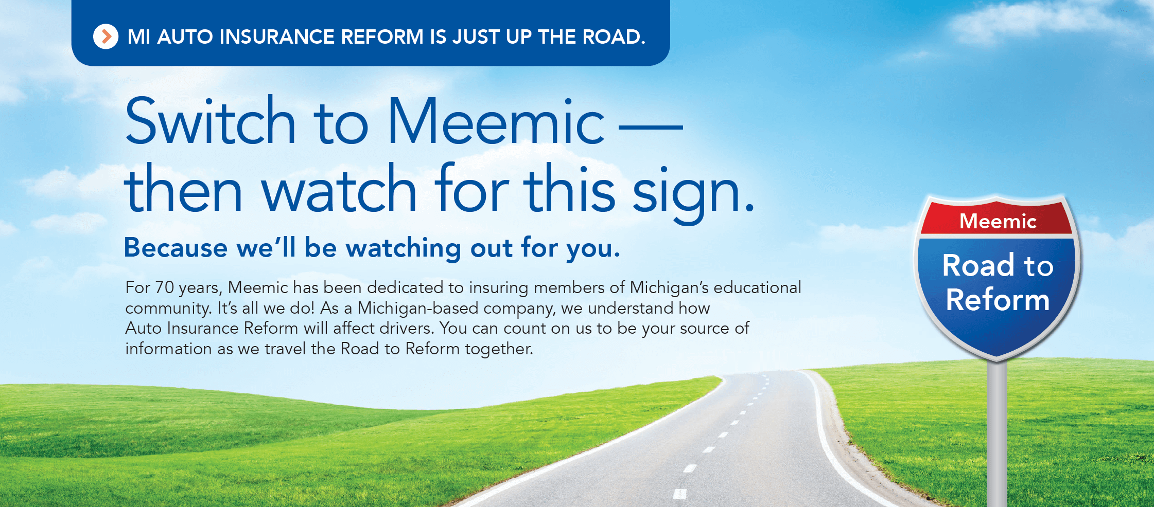
2. “Road To Reform”
Auto insurance has been notoriously expensive for motorists living in Michigan. Last year, consumer pressure resulted in the state government passing legislation to reform it. Our long-term client — Meemic, a subsidiary of AAA — needed a direct response campaign to drive home the reform message to prospects as well as members.
Our team went to work, and the “Road To Reform” was paved with an iconic mnemonic to set the stage for the campaign, paired with a colorful design template that struck a balance between information and advertising.

A nearly year-long multichannel promotion — with digital ads (Facebook included), direct mail, video, and print — “Road To Reform” leveraged the Meemic brand to showcase our client as the authority on Michigan auto insurance reform and the best destination for big savings. The campaign also proved that brand identity becomes more powerful the more media channels you have working together.
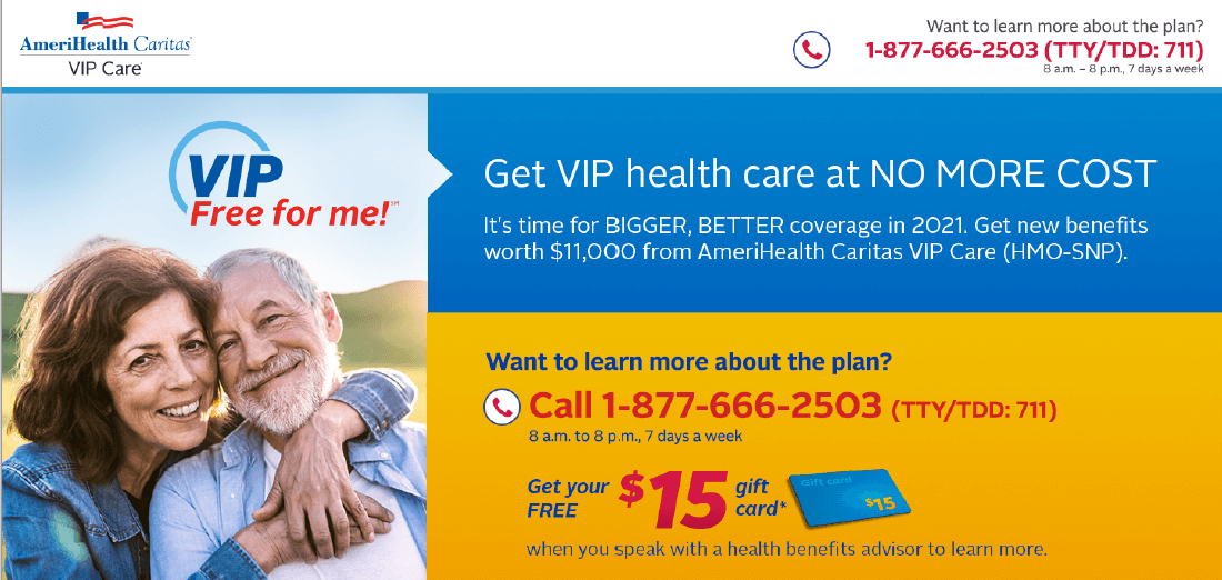
3. “VIP Free for me!”
A well-known regional health insurance plan needed a healthy refresh to their brand, but they also wanted a rallying cry for new members. DMW had just what the doctor ordered: VIP Free for me!

We created a service mark-level logo using the existing brand color palette and type font to tie the brand to its core value proposition: a $0 premium plan with valuable extra benefits and highly personal services. From there, we rolled out a colorful, compelling multichannel campaign that increased awareness as well as the plan’s membership base.
So if you’re looking to build your brand, your market share and see an immediate boost in response, talk to DMW.
We’ll tell you more about how to turn your brand into an Action Brand™ … which means dialing up “What’s In It For Me,” including an offer and Call To Action, and generating leads and conversions across all media channels.
Contact us today for a no-obligation consultation.